 |
 |
 |
 |
 |
 |
 |
 |
 |
 |
|
|
design and the art of depicting reality
To visualize this data is to understand it. My article posted at MOMA blog reflects on the specific circumstances of data visualization design in the Korea. the original post *here* |
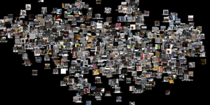
Again SEIUN (世運商街) Seiun Sanga has been renovated as city recreation project in 2017. This visualization depicts our auditory memories with visual remembrance of the building. more details will be ready soon! |
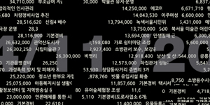
city data ; seoul daily expenditure Can public data describe our city? If so, what would that data be? Can public screens be the medium for increasing public awareness? more details below |
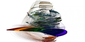
3D mind map in immersive virtual environment
Visualizing a mind-map in a virtual three-dimensional space, which displays how small thoughts relate to each other and come together to create one big idea as a result. more details below |
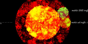
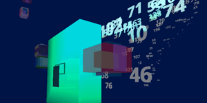
mobile traffic data visualization
the growth of data usage by smartphones more details below |
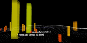
social networkservice data, intel
The influence of Social Network Service on Intel marketing and communication more details below |
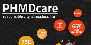
forming healthy nations!
Health and Well-being index = balancing environmental factors and social structures more details below |
my health manager
This page will be updated soon. more details below |
* PRESS * | *OLD GRAPHIC WORKs* |
 |
 |
 |
 |
 |
 |
 |
 |
 |
 |
|
|
studies / practices
Can we change our behavior or way of thinking by seeing data? This site contains my experimental visualizations based on this question. more details below |
What if machines can see music….? visualization of machines with imagination Can machines be creative? Myabye YES, because, machines can see things from different perspectives, not like human and never like human can image. more details below |
Optical data and the subjective values Perspective shapes perception and perception influences the value of information. This project portraits data as an objective material while information is received subjectively. more details below |
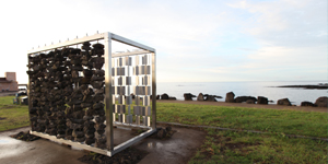
unpredicted possibility Identity. Is it a given image or built by someone’s purpose? This kinetic installation represents the institute’s identity as it’s movement and shape are generated by researchers’ daily data. more details below |
poungru(風樓) -
naturally forced, essentially formed Pongru (風樓) means “open space in the breeze” in the original Chinese character. This pavilion reacts to wind force. Strong winds eliminates the space, light breeze brings the space back. more details below |
data currency, powered by network actions Can we place value on our daily network activity in terms of labor? more details below |
data formation What if we apply data to a physical space? Could it be an effective way for us to be more more conscious of our energy consumption? more details below |
circulating data The process of transferring data from where it was produced to those who need it. more details below |
gender ratio Data visualization affects our decision making. more details below |
redefined city integrated definition about cities where we live in more details below |